
Car Rental Booking App
Cross-Border Booking Experience
Designed a cross-border booking experience that helps travelers make confident rental decisions through localization, transparent workflows, and trust signals.
Role:
UX Designer
Timeline:
8 Weeks
Methods:
User Interviews
Journey Mapping
Usability Testing
Team:
Cross Functional
Product Team
FOCUS ARIAS
User Research
Booking Workflows
Cross-Cultural UX
Trust Signals
Decision Support
Mobile UX
User Journeys

Project
The booking process involved multiple decision points where uncertainty could interrupt user progress — including pricing transparency, return policies, insurance options, and regional differences. The project focused on reducing cognitive load and creating a clearer path toward confident booking decisions.
My Role
Owned research and experience design activities across discovery and solution phases. Synthesized user behaviors and pain points into structured workflows, interaction patterns, and decision-support experiences.
Timeline
8-week iterative design cycle covering user research, insight synthesis, concept exploration, prototyping, and usability validation.
Research & Discovery:
from problems to insights
Understanding why users abandon bookings and how clarity
builds trust.
Problem Statement
User research revealed that key decision points within the booking flow created uncertainty and interrupted user progress. Inconsistent information, pricing ambiguity, and unfamiliar policies reduced trust and increased booking abandonment.
Goal
Design a booking experience that reduces decision friction and supports confident user actions through transparent information architecture and intuitive workflows.
Research Audience
Research included international travelers, families, and frequent renters representing diverse travel behaviors and varying levels of digital confidence.
Research Methods
User Interviews · Competitor Benchmarking · Heuristic Evaluation · Journey Mapping · Usability Testing
Key insight
Users were not struggling with the number of choices — they were struggling with uncertainty. Transparent pricing, predictable policies, and clearer decision points had a greater impact on confidence than adding additional features.
User Personas
Four key traveler segments identified through research, representing distinct booking behaviors, needs, and decision patterns.
Couples & Leisure Travelers

Decision Profile
Emotion-driven
Trust-sensitive
Experience-focused
Goals
Smooth and stress-free booking
Clear options without overload
Comfortable vehicle for travel and luggage
Needs
• Transparent pricing
• Easy insurance comparison
• Predictable checkout experience
Pain Points
• Too many options
• Confusing add-ons
• Unclear insurance policies
Booking Context:
International vacation
Special trip
Budget-Conscious Travelers

Decision Profile:
Price-driven
Comparison-focused
Fast decision behavior
Goals
• Lowest total cost
• Quick deal comparison
• No unexpected charges
Needs
• Clear total cost upfront
• Simple price filtering
• Flexible options without forced add-ons
Pain Points
• Hidden fees
• Misleading vehicle categories
• Upselling pressure
Booking Context:
Weekend trips
Budget travel
Family
Travelers

Decision Profile
Safety-first
Stability-focused
Low tolerance for friction
Goals
• Safe and spacious vehicle
• Simple pickup and return process
• Clear family-related requirements
Needs
• Child seat options
• Vehicle size clarity
• Transparent return instructions
Pain Points
• Unclear vehicle sizing
• Extra charges for family add-ons
• Confusing return conditions
Booking Context:
Domestic and international family travel
Mature Travelers
(55+)

Decision Profile
Predictability-driven
Risk-averse
Clarity-dependent
Goals
Simple and intuitive experience
Clear policies and pricing
Fast completion without distractions
Needs
Large readable interface elements
Straightforward booking process
Language and currency clarity
Pain Points
Complex navigation
Too many decision points
Ambiguous return conditions
Booking Context:
Occasional travel
Leisure travel
User Flow Strategy
Structuring intuitive navigation and reducing decision friction
The navigation structure was designed to simplify user movement across key booking stages and provide faster access to critical information.
Key pathwaysOnboarding · Search & Discovery · Comparison · Booking · Rebooking · Account Management

Booking Flow
Enabling confident booking decisions through transparent workflows
The booking experience guides users through search, comparison, protection selection, and checkout while increasing transparency around pricing, policies, and booking requirements.
Key stages
Search · Compare · Protection Selection · Add-ons · Checkout · Confirmation

Information Architecture
The information architecture was designed to support predictable navigation, reduce cognitive load, and provide faster access to critical decision points throughout the booking experience.
Core User Workflows
Home / Search
Pickup / Drop off Location
Date & Time
Search Filters
Search Results
Vehicle Details
Add-ons
Coverage Options
Checkout Review
Booking Confirmation
My Trips
Upcoming Trips
Booking History
Trip Details
Pricing Summary
Modify Booking
Cancel Booking
Rebook Vehicle
Supporting Platform Functions
Account
Personal information
Driver license & Identity Verifications
Payment methods
Transaction History
Saved Preferences & Settings
Support
FAQs
Help Center Articles
Contact support (chat / phone)
Rental Policies & Fees
Coverage Information
Settings
Language
Currency
Notifications
Accessibility Settings
Legal & Terms
Competitor & Market Analysis
A focused evaluation of leading car rental platforms to identify UX gaps, friction points, and opportunities for differentiation — especially for international travelers.


Key UX Friction Areas
Hidden pricing & late fees
Insurance, add-ons, and additional costs often appear late in the booking flow.
High cognitive load
Users face excessive choices and competing decisions throughout the booking journey.
Inconsistent return workflows
Changes in return locations frequently affect pricing without clear explanation.
Low pricing transparency
Coverage details and policies are often difficult to understand.
Mobile interaction complexity
Critical actions require excessive steps and screen transitions.
Opportunity Areas
Transparent pricing framework
Present all costs, policies, and protection details upfront to build trust.
Progressive decision support
Reduce cognitive load by revealing information step by step.
Integrated rebooking experience
Allow users to modify or rebook directly within "My Trips" without navigating through separate flows.
Localization & traveler guidance
Provide clear language, currency, and return instructions by region.
Mobile-first optimization
Simplify flows, reduce taps, and optimize key screens for mobile.
Key Takeaways
Booking confidence drives user decisions
Clear information and predictable interactions had greater impact than adding new functionality.
Transparency builds trust
Surfacing costs, policies, and requirements earlier reduces uncertainty and supports confident decisions.
Structured workflows improve completion rates
Reducing cognitive load and simplifying navigation helps users move through booking with less friction.
End-to-End Booking Flow
High-fidelity booking workflows designed to support transparent decision-making, predictable navigation, and confidence-driven interactions across the rental journey.
Business Context
The platform supports both local and international travelers navigating unfamiliar rental policies, pricing, and insurance requirements.
The experience needed to accommodate varying levels of digital confidence while maintaining clarity during high-impact booking decisions.
UX Objective
Design a structured booking experience that reduces decision friction and improves pricing transparency across the rental journey.
Support informed decision-making through predictable workflows, contextual guidance, and confidence-driven interactions.
Vehicle Details
Clear vehicle details and upfront pricing before booking.

Protection Plan
Evaluation
Compare protection tiers before coverage selection.

Recommended Coverage Selection
Recommended plans reduce uncertainty during selection.

Coverage Details & Plan Comparison
Expanded coverage details support informed comparison.

Risk Acknowledgment Flow
Risk messaging appears before unprotected bookings.

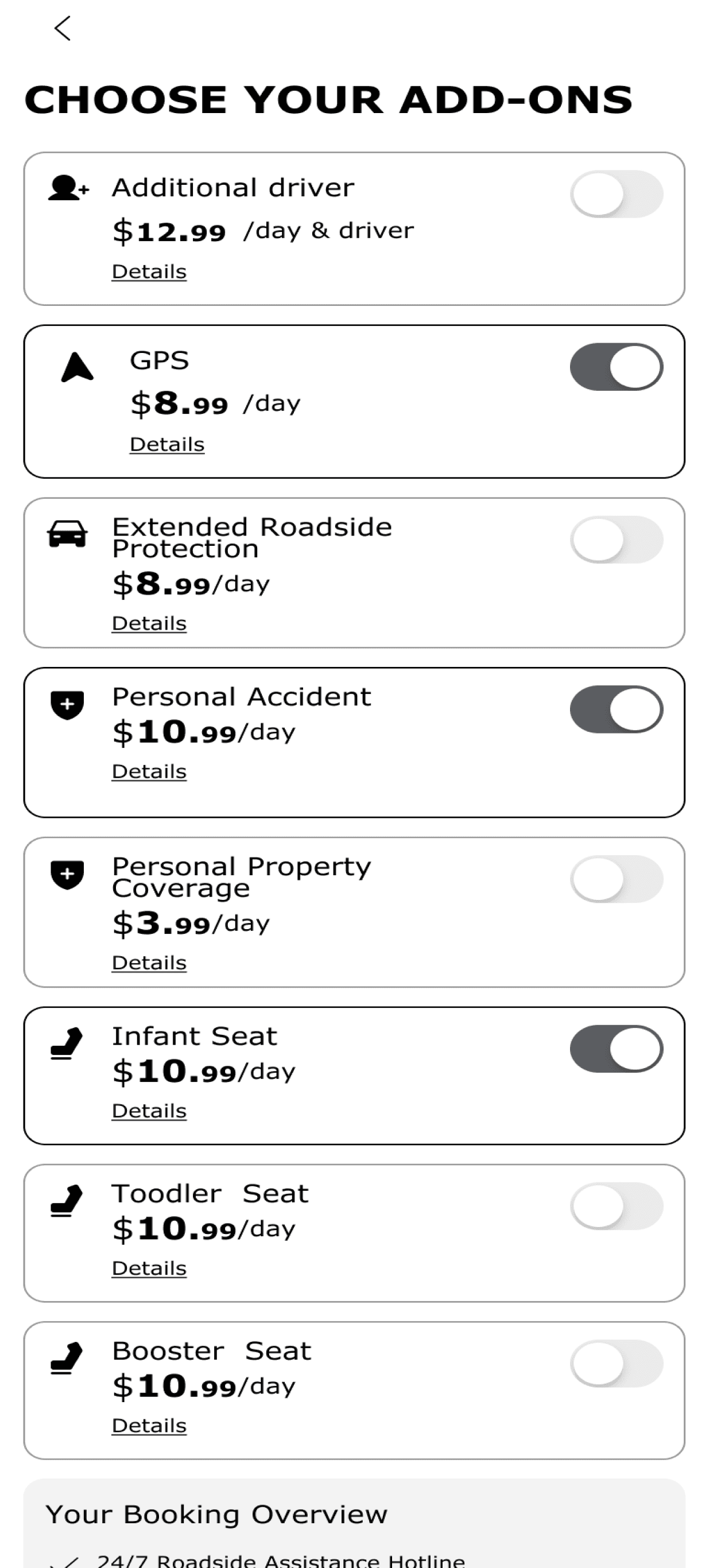
Optional Services & Dynamic Pricing
Optional services update pricing in real time.
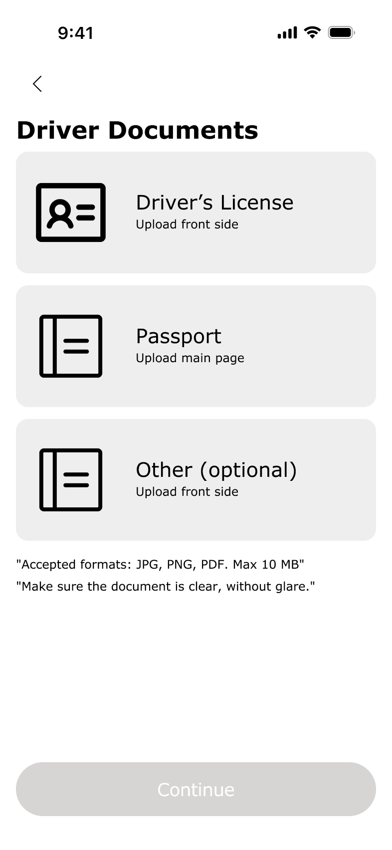
Driver Verification Flow
Driver identity and required documents are verified upfront to reduce operational friction, improve compliance accuracy, and support a smoother booking confirmation process.
Driver Information
Required user information collected before verification.

Document Submission
Essential identification documents submitted for review.
Verification Approved
Verified documents confirmed and ready for booking.

Verification Failed
Document upload errors surfaced with guided correction actions.

Booking Summary
Structured review and confirmation flow focused on transparency, pricing clarity, and confident decision-making.
Final review of pricing, trip details, and selected protection before confirmation.

Protection Required
Risk messaging appears when coverage is missing or incomplete.

Booking Confirmation
Final confirmation with next-step guidance and post-booking instructions.

Operational Design Principles
Progressive Disclosure
Information is introduced progressively to support focused decision-making.
Informed Risk Handling
Risk states and liability details are surfaced before confirmation to support informed user actions.
Pricing Transparency
Pricing, coverage, and booking costs remain visible throughout the flow to reduce uncertainty.
Real-Time Cost Control
Add-ons dynamically update pricing to maintain visibility and improve decision confidence.
Upfront Verification
Driver validation is completed upstream to reduce downstream operational issues.
Interaction Logic
Consistent layouts and interaction logic create familiarity across booking stages.
Final Product Experiance
Cohesive interface patterns supporting transparent, confidence-driven booking workflows.

Strategic Product Reflection
Key strategic decisions and operational principles shaping the final booking experience.
Design Principles
The experience was structured to reduce decision friction, improve transparency, and support confident user actions across critical booking stages.
Consistent interaction patterns and predictable workflows create a scalable foundation for efficient booking and verification processes.
Strategic Outcome
The final experience established a clear operational structure that improves pricing visibility, simplifies verification, and supports informed decision-making.
Standardized interaction patterns reduce downstream support friction while maintaining clarity across complex booking scenarios.
Final Reflection
This project demonstrates how enterprise-focused UX can simplify operational complexity through structured flows, transparency, and predictable system behavior.
Prioritizing clarity and consistency throughout the experience strengthens user confidence while supporting scalable product growth.

Designing systems that drive real operational impact
Focused on enterprise workflows, operational platforms, and AI-driven decision support
Currently open to product design roles focused on enterprise platforms and AI-driven products.

© 2025 Dina Lee. All rights reserved.