
Hi There
This is where I share my thinking —
insights brewed with intention, like good coffee.
Observations, decisions, and reflections shaped by real design work.

Meanwhile, feel free to explore my work.
My
Design
Approach
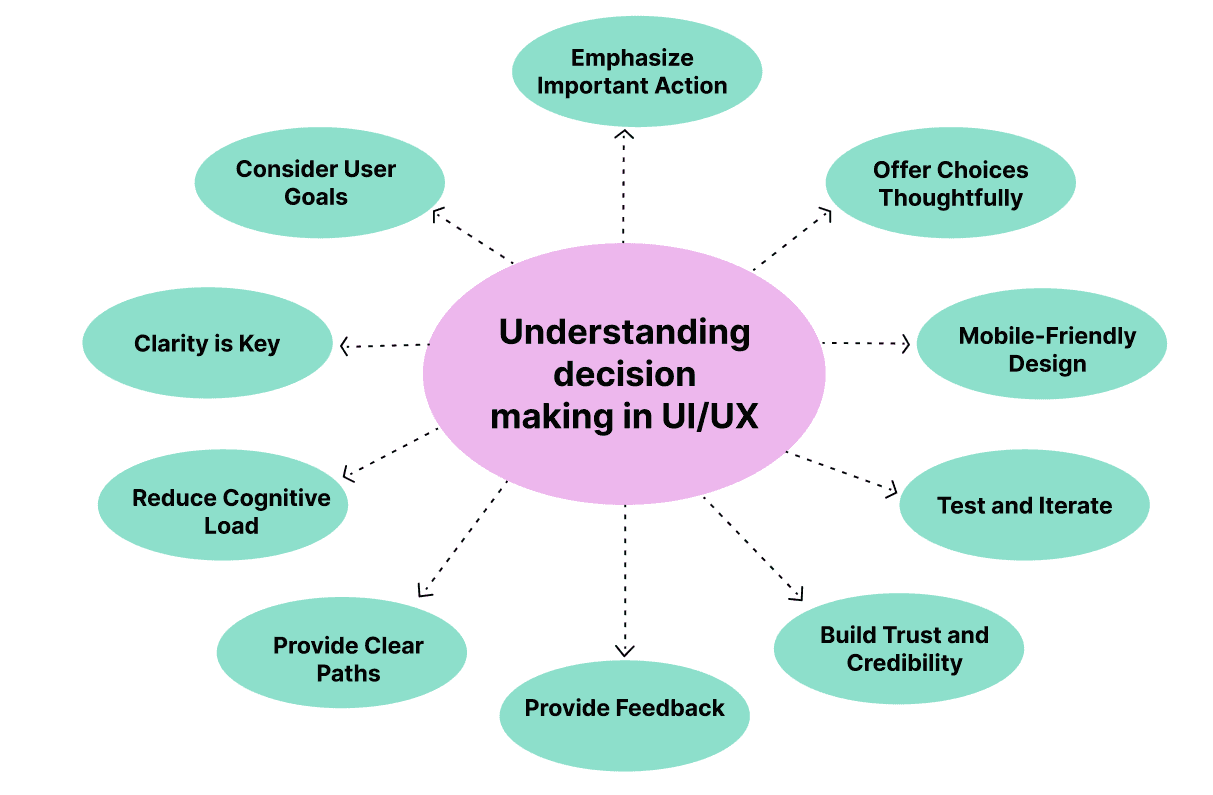
I design for how systems work.
I simplify complexity, reduce friction, and help people achieve their goals with confidence.
Good design creates clarity and direction.
It reduces cognitive load, supports better decisions, and helps users move through tasks with ease.
Consistent, thoughtful interfaces build trust and make products reliable.
AI Can Design
But It Can’t Decide
AI accelerates execution, but it doesn’t carry responsibility for decisions.
AI can generate screens, layouts, and content in seconds, making the design process faster and more efficient. But speed alone doesn’t define good design. It doesn’t understand context, question assumptions, or evaluate trade-offs between user needs and business goals.
Design goes beyond output. It requires judgment — the ability to decide what matters, structure complexity, and create clarity in uncertain situations. While AI can support the process, it doesn’t replace the thinking behind it.

Good design is not what gets generated —
it’s what gets decided.
How I use AI in My Design Process
AI helps me move faster — without taking over the work.
I use AI as part of my everyday UX process to reduce friction in routine tasks. Things like drafting content, refining wording, organizing notes, or structuring early ideas used to require significant time and attention.
With AI, that overhead is lower. It helps me move through the mechanical parts of the process more efficiently — without cutting corners — so I can focus on what matters most: thinking, making decisions, and shaping the experience.
Design is where systems meet human judgment.

AI increases productivity, not autonomy.
It doesn’t design for me.
It doesn’t decide what’s right.
And it doesn’t replace judgment.
I treat AI as a supporting system — not a decision-maker. A way to accelerate execution while keeping responsibility, intent, and final decisions with me.
AI suports the process.
Design thinking stays human.
Why I chose clarity over noise
In environments where users make decisions, clarity isn’t aesthetic — it’s functional.
At some point, I stopped asking how to make things stand out —
and started asking how to make them understandable.
Most interfaces today compete for attention: animations, visual effects, clever patterns.
But in complex systems, this often creates friction instead of value..
Clarity doesn’t compete.
It guides.
It reduces cognitive load, supports focus, and helps users move through decisions with confidence.
This becomes critical in enterprise environments, where users don’t explore —
they act.
That’s why my work prioritizes structure over decoration, intention over trends, and calm over noise.
Clarity is not minimalism for aesthetics.
It’s a decision-making strategy that respects the user’s time, focus, and trust..


How small UX decisions shape trust
Trust isn’t a feature — it’s an accumulation of small, consistent decisions users experience over time.
Trust isn’t built through bold visuals or big statements.
It grows quietly — through small, consistent decisions over time.
A layout that feels familiar from the first interaction. A button that behaves exactly as expected. A flow that answers questions before they’re asked.
These moments rarely draw attention to themselves. And that’s precisely why they work.
When interfaces feel calm, users feel confident. When systems feel predictable, people feel safe.
Because trust is not a feature — it’s an accumulation of signals.
I focus on these details because they shape how a product is experienced
long before users form a conscious opinion about it.


Trust isn’t designed in one screen.
It’s built through consistent, predictable decisions over time.
The Feedback that made me pause
I start with who it’s for — and what it needs to support.
Someone once looked at my website and said it felt “too empty” and “junior” — that it made them want to leave quickly.
That comment stayed with me.Not because it was harsh, but because it revealed something important: Design doesn’t exist in a vacuum.
Before deciding how something looks, it’s critical to understand who it’s for — and what it needs to support.
For some audiences, expressive and visually rich interfaces feel engaging.
For others, the same approach creates friction.
Many people associate visual density with professionalism — assuming that more elements mean more value. But in complex systems, more often means harder to understand.
I don’t design to impress for a few seconds.I design to guide, reduce cognitive load, and help users understand what matters — quickly and with confidence.
What may feel “empty” to one person is often intentional clarity to another.
Calm layouts and restraint aren’t signs of inexperience — they’re deliberate decisions shaped by context, audience, and purpose.
Simplicity is not a lack of ideas.
It’s a reflection of clarity.
Small UX decisions
Big trust problems
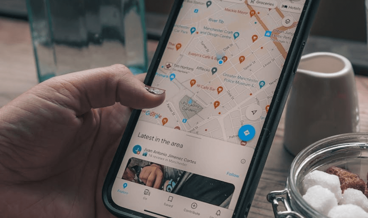
Platforms people trust most are the ones they can access instantly.
When I worked as a Realtor®, OneHome was positioned as a client experience platform.
In reality, it functioned more like a controlled extension of the MLS — accurate in data, but disconnected from how people actually search for homes.
For buyers, the experience felt restrictive.
Listings were shared through agent-generated links and limited to predefined criteria.
Any change — adjusting filters or expanding the search — required contacting the agent, reducing autonomy and exploration.
The platform also lacked a mobile-first experience, making it feel outdated compared to modern real estate apps.
As a result, OneHome didn’t feel like a personal tool. It felt controlled.


At the same time, both buyers and sellers relied heavily on platforms like Zillow, Realtor.com, and Redfin.
These platforms weren’t just easier to use — they felt present.
Dedicated mobile apps made them fast, familiar, and always accessible.
Buyers could browse freely and stay in control of their search.
Sellers could track activity — views, saves, and engagement — directly from their phones.
OneHome, by contrast, relied on a responsive web experience instead of a native mobile app.
While functional, it lacked immediacy, convenience, and a sense of continuity in daily use.
Over time, this difference mattered.
Platforms that live on the phone feel more trustworthy, more current, and more “alive” —
even when their data is less complete.


User autonomy is a core component of trust —
systems that restrict exploration reduce perceived control and confidence.

Designing systems that drive real operational impact
Focused on enterprise workflows, operational platforms, and AI-driven decision support
Currently open to product design roles focused on enterprise platforms and AI-driven products.

© 2025 Dina Lee. All rights reserved.